White Paper Describing my Final Project
Sarah Salimi
Introduction to Research Questions and Dataset
For this project, I knew I wanted to investigate something related to women’s rights around the world. I have always wondered how we can live in a world with so many technological advancements, yet also accept that women are systematically undervalued and under-resourced worldwide.
I initially wanted to visually investigate whether countries with higher GDPs tended to perform better on women’s rights. However, I expanded my questions to allow for more possible visualizations. My questions became:
- In which countries (or regions) do women have the most access to education; the labor market; and legal protections?
- Do countries that “do better” on women’s rights tend to share any common traits?
- If women have more legal protections in certain countries, is it also true that these countries will have better maternal health outcomes?
I knew that I wanted to use survey and administrative data to answer these questions, so I cobbled together data from 4 sources: 1) the World Bank Gender Portal; 2) World Population Review; 3) Our World in Data; and 4) Kaggle. Merging all of these datasets in R on country-IDs and year allowed me to produce the following dataset, which had 142 rows:
Excerpted Dataset
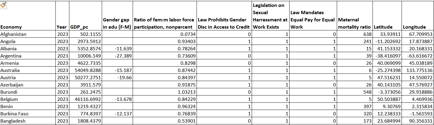
In it, each row represented a country and provided information about the state of women’s rights and other social trends. I chose 2023 because it was the most recent year for which I could find data. While there were originally 29 variables in my dataset, I ended up only focusing on these:
- Economy: The name of the country
- Year: The year for which data is collected (this is 2023 throughout)
- GDP per Capita: Computed by dividing country-level GDP by population size. This is reported in 2023 dollars
- Gender Gap in Education (F-M): According to the data dictionary, this represents the percentage of working-age males with basic education subtracted from the percentage of working age females with basic education in a given country. (What “basic education” means was not defined.)
- Ratio of female to male labor force participation: A ratio indicating how many working-age women worked for every man in the economy. If the ratio is a decimal less than 1, women trail men in labor force participation.
- Legislation on Sexual Harassment: A binary variable indicating whether or not a country has national laws criminalizing sexual harassment at work
- Legislation Mandating Equal Pay: A binary variable indicating whether or not a country has laws mandating equal pay for men and women who do equal work
- Legislation Prohibiting Gender Discrimination in Access to Credit: A binary variable indicating whether or not a country prohibits financial institutions from discriminating against women who seek access to credit
- Maternal mortality ratio: A continuous measure of the number of deaths per 100,000 mothers
- Latitude and Longitude: Geographical country coordinates
I also ended up creating a handful of categorical variables in Tableau so that I could perform more complex analyses:
- GDP (categorical): The relative GDP of countries, with countries marked as “high” if per capita GDPs are greater than $25,000; “medium” if countries have per capita GDPs between $10,000 and $25,000, and “low” if countries have per capita GDPs below $10,000
- Legal protections: Countries are grouped into buckets based on the number of legal protections they afford women out of the three that were included in this dataset (i.e., no protections, 1 protection, 2 protections, or 3 protections)
- Maternal Mortality (categorical): Countries are grouped based on the number of maternal deaths per 100,000 mothers (i.e., 1-300 deaths, 301-600 deaths, 601-900 deaths, and 901-1,200 deaths)
- Region: Countries are assigned to one of 6 different areas (i.e., Europe; Africa; North America; Latin America and the Caribbean; Asia and the Middle East; and Australia and the Pacific)
Visualizations and Justifications
The following section walks through each of the 11 figures that I produced, focusing on my design choices, feedback I received in Studio Critique, and what inspired certain visualizations:
Figure 1 (top) and Figure 2 (bottom)
What they are: These were designed to provide a picture of how different countries in the world fare on women’s labor market participation relative to men. In Figure 1, the top 19 countries with the most women participating in the labor market are depicted and ranked in a table. In Figure 2, a choropleth is used to depict each country’s gendered labor participation rates worldwide. There are five color steps used, and the darker the shade of brown, the more women work relative to men.
Choices and Justification: I wanted to pair a table with a choropleth so that readers could get a sense not just of the countries that “do the best” on women’s relative labor force participation (Figure 1), but also which countries had lower labor market participation rates (Figure 2). If I had made just a table, it would have ended up being over one hundred lines long, which my Studio Critics said would be visually dense. In my choropleth, I was inspired to use different gradations of one color tone so that darker areas would represent “more” female labor force participation. This use of color to convey concentration is a visual technique we learned about in our lecture on mapping.
Figure 3
What it is: Figure 3, like Figure 1, is a table depicting country-level trends using a ranking system. This table focuses specifically on how many women are educated relative to men (as a percentage) in a given country.
Choices made and justification: Because data was only available for 73 countries (half of the dataset), I decided to make an exhaustive list of all countries in the dataset. I didn’t think it would make sense to make a choropleth as well because most of the world would be blank (or “greyed out.”) To make it possible to compare regional trends in female education, I included the region to which each country belonged. I would have liked to make the first row stand out more, perhaps using red to indicate that Moldova was the only country in the world where women do not have an education gap with men. However, I could not figure out how to modify the formatting of individual table rows in Tableau.
Figure 4
What it is: This is a pie chart small multiples graph where each region is its own circle, and the percentage of countries per region with at least 1 gendered legal protection is documented.
Choices made and justification: I chose to use a small multiples graph because it is a good way to show relative percentages across groups (in this case, regions). As we discussed in class, using angles (or pie slices) to represent proportions is a commonly accepted convention in design. Furthermore, I used pink in the title (and in the pie charts) to index countries where at least 1 legal protection was offered. I used grey to index countries without protections because it is a color that fades into the background and wouldn’t pull focus. I chose to add call out boxes naming the countries that did not offer protections in each region because there were so few of them, so it was realistic to fit them all in my graphic. Plus, my Studio Critics wanted to see more granularity in this visualization, and adding country-level information was a way to do that.
Figure 5 (top) and Figure 6 (bottom)
What they are: Figure 5 is another choropleth, this time visualizing GDPs per capita in individual countries. Figure 6 is another way of looking at country-level GDPs. It is a scatterplot in which countries are represented by dots. This graph measures relative female labor force participation (x axis) against country-level GDP per capita (y axis). In both Figures, GDP per capita is used (rather than GDP) so that data is normalized and comparable across countries.
Choices made and justification: I created Figure 5 so that viewers could see at a glance how wealthy individual countries were. Once again, the darker the color, the “more” of something (in this case, higher GDP per capita). Figure 6 was an extension of Figure 5. This time, countries were assigned colors representing their GDP levels (e.g., blue, red or orange). Not only was using color to indicate GDP visually appealing, but it allowed me to hide the y axis, which Studio Critics recommended as a way to declutter my graphic. The decision to hide the y axis was also inspired by our discussions in class around having more spare, efficient graphs–such as those Robert Tukey made in the late 1900s.
Of note, one compromise I had to make was deciding arbitrarily which countries to categorize as “low,” “medium” and “high” GDP. I decided that countries with per capita GDPs less than $10,000 would be low GDP, countries with per capita GDPs between $10,000 and $25,000 would be medium GDP, and countries with per capita GDPs greater than $25,000 would be high GDP. I used my own understanding of money and how much things cost to make this determination, but I’m not sure if economists would agree with the thresholds I chose.
Figure 7
What it shows: This is a bar graph representing different regions around the world. Each bar totals one hundred percent and consists of all the countries in that region. On the y axis, the relative percentage of countries in each region offering a certain protection (equal pay) is displayed.
Choices and justification: This graph was the one I struggled most with. It achieved my primary goal, which was showing relative percentages of regions that do and do not offer protections for equal pay. Once again, pink was used to represent countries with this protection, and grey represents the share of countries without protections. I thought using consistent colors throughout my visualizations would create familiarity and ease for my viewers.
The decision to call out examples of countries that fell into different legal categories was intended to be a commentary on GDP (i.e., to show that GDP doesn’t necessarily predict how progressive a country’s legal system is). For example, France, Germany and the UK are high GDP countries that do offer protections, but Japan–another high GDP country–does not. We also see that some very low GDP countries, like Angola, South Sudan and Rwanda—offer legal protections, suggesting that countries with low GDPs can have progressive legal systems. However, one criticism I have of this graph is that the connection to income is not readily apparent, and it relies on the viewer having already consumed my earlier graphs about income (e.g., Figure 5). If I had more time, I think I should have devised a way to make this Figure a stand-alone so that the connection to income was more apparent. Perhaps I could have made three pie charts–one for high, medium and low GDP countries. I could have then used pink and grey once again to index the relative share of countries with and without legal protections.
Figure 8
What it shows: This is a vertical scatterplot that compares the average female labor force participation rate for countries based on the number of legal protections the law affords women.
Choices and justification: Color is used to signal that there are 4 different categories, so that the reader does not only have to rely on the x axis labels to see that these categories are different in some way. The y axis is women’s labor force participation relative to men, but I hid it to reduce the “noise” in this graph. Making graphs less dense is a concept that Nathan Yau emphasizes in his writings.
I then included group-level averages marked by dotted lines in each category, so that viewers could see how countries with different degrees of legal protections might differ on female labor force participation rates. Notably, I could have used a bar chart, which we learned in class is commonly used to index frequency. However, a bar chart is a more aggregated graphic and would not have allowed me to depict the spread of different countries on the vertical axis. Finally, Studio Critics recommended that I make the circles more transparent so that one could get a sense of the density of the dots (or countries), and I found that that was a strong addition to this visualization.
Figure 9
What it shows: This is a small multiples scatterplot where countries are separated into different “panes” by GDP per capita. Each circle represents a different country. The x axis depicts a country’s gender gap in education (with negative numbers meaning that women trail men in educational attainment). The y axis shows how many women work for every man (with ratios less than 1 showing that women trail men in labor force participation).
Choices and Justification: I chose a scatterplot because we learned in class that it is an effective way to compare two continuous variables, which I had in this image (i.e., education rates and labor force participation rates). Furthermore, I was inspired to use small multiples because it seemed like an effective way to separate out countries by GDP, which I felt was important (so that countries would be compared to those that were similar to themselves). Once again, I used different colors to indicate low-medium-and high GDP countries (as in Figure 6). Not only was this red-blue-orange color palette designed to create visual consistency for the audience, but also to make it immediately apparent that each scatterplot represents a different GDP category. Finally, Studio Critics commented that it was important to label the x axis, “Gender Gap in Education (Female-Male)“–rather than just “Gender Gap in Education.” I followed this suggestion so that viewers could infer that negative values meant women trailed men in educational attainment.
Figure 10 (top) and Figure 11 (bottom)
What they show: Figure 10 is a graduated symbol graphic comparing maternal mortality rates in countries with and without legal protections for sexual harassment. Each circle represents a different maternal mortality category, and the size of each circle corresponds to the percentage of deaths that fall into this category. Figure 11 uses pie chart small multiples to explore maternal mortality rates in low, medium and high GDP countries.
Choices and Justification: In both Figures, Studio Critics recommended that I add a note about how maternal mortality is calculated (i.e., deaths per 100k mothers), which I think adds important context. In Figure 10, pink and grey are used again to indicate which countries do and do not offer legal protections against sexual harassment. I used graduated symbols in Figure 10 because it would allow me to compare the sizes of different categories visually, and that was exactly what I wanted to do (i.e., compare how countries with and without protections for harassment performed on maternal mortality).
In Figure 11, I chose to use different shades of blue to correspond to the degree of maternal mortality, with darker shades representing higher maternal mortality ratios. This was similar to my use of color in the previous choropleths. I also decided against making the colors of the circles different for low-medium-and high GDP countries because then it would be harder to compare across GDP categories. Notably, Studio Critics pointed out that I could have used another graduated symbol graphic here, but I thought that having three graduated symbol graphics (for low, medium and high GDP countries) would get too messy, and that a pie chart small multiples graph would be visually simpler.
Remarks on the Process of Visualizing
Visualizing for this project was harder than I anticipated it would be. I made many more visualizations than I thought I would need, and not every one made it into the final project. In doing so, I realized that visualization is a way of understanding data and “slicing it” in different ways to assess trends. While I had initially only been interested in how countries with different GDPs differed in women’s rights and protections, I ended up also exploring which regions are most likely to afford these protections. I also ended up including a maternal health variable that was not a part of my proposal, but which I felt was an important indicator of women’s rights. Upon finishing my project, I realize that there are many more visualizations that I could have made and more variables I could have explored. However, this just goes to show that visualization is an iterative process, and one’s visualizations will necessarily change as s/he learns more and receives feedback. Maybe one day I will return to this data and produce completely different visualizations….who knows?